How to describe a country...
How are the countries of the world different from each other? Often we talk about countries within a particular region or continent, but these groupings are somewhat arbitrary and contested (is Russia a European country or a Eurasian one?). Moreover, countries such as South Korea and Australia have higher incomes and levels of development than their immediate neighbours - making them much more similar in this regard to the United States or the countries of Western Europe.
This analysis groups countries into one of four clusters based on around 30 indicators sourced from the World Bank and Freedom House. These indicators mainly relate to levels of economic development, demography, infrastructure, governance and political freedoms.1
Clustering countries using Principal Component Analysis and K-Means
Many of the indicators we explore are correlated with each other. For this reason, we first use a statistical technique called Principal Component Analysis (PCA) to reduce the dimensionality of the data and identify those variables which are most important in explaining variation between countries. We then cluster the principal component projections of the data using the k-means algorithm.
Using k-means allows us to place countries into clusters in which member countries are more similar to each other across the transformed values than they are to countries in the other clusters. Through different data visualisations, we explore some of indicators that determine this clustering and best explain how countries differ.
The underlying analysis for this post was written in R. The code is provided at the end of this page as well as in the accompanying GitHub repo. The visualisations were created with D3 and visx.
Wealth: How rich are people in this country?
One good way of telling countries apart is to look at how much income a typical person within the country has in a given year. Moreover, higher incomes are often associated with many other desirable traits, such as better public health, access to education or better infrastructure.
The graph below shows GDP per capita and life expectancy across the countries in our dataset in 2019. Two trends are immediately apparent. First, the countries in the Rich, well governed and free cluster are all positioned towards the top right of the chart. Per capita GDP in these countries is by and large greater than $15k and people in these countries can expect to live to the age of 75 or more.
Second, we can see the concentration of the Poor, but young countries towards the bottom left of the chart. The richest countries in this group have average incomes of just $7-8k, and most of the countries in this cluster have incomes of less than $2k. The median life expectancy in this cluster is only around 65 years.
Income and life expectancy
Between these two clusters are our two other groups - (mostly) big and developing and Small, (mostly) free and developing. These clusters have similar levels of GDP per capita and life expectancy, and so looking at income is perhaps not the best way to tell them apart.
These patterns are broadly similar if we look again at GDP per capita and the percentage of the population in each country using the Internet. However, we can perhaps discern that Internet usage is generally higher in the (mostly) big and developing cluster than the Small, (mostly) free and developing cluster.
Income and Internet usage
Governance: How well is this country governed?
The quality of government is another good way of separating countries. The Worldwide Governance Indicators (WGI) project at the World Bank provides a single score for several different governance indicators, including adherence to the rule of law, how well designed regulations are and how effective government in each country is.
These scores are based on 30 individual data sources produced by a variety of survey institutes, think tanks, non-governmental organisations, international organisations, and private sector firms. The composite measures of governance range approximately between -2.5 (very bad governance) to 2.5 (very good governance).
The boxplot below shows the scores of each country cluster for three different governance indicators. While there’s some variation within each group, we can see these indicators effectively separate the Rich, well governed and free cluster from the Poor, but young clusters.
It’s worth noting that good governance isn’t necessarily the same thing as political freedom. Countries can have very effective governments and still be illiberal, and vice versa.
Worldwide governance indicators
Select indicatorDemographics: How young are people in this country?
The population of some countries are younger than in others. The histogram below shows the distribution of people under the age of 40 in each country across the dataset. Each cell represents a country. There are 35 countries in which less than 20% of the population are over the age of 40. All but one of these countries belongs to our Poor, but young cluster.
On the other end of the histogram, we see a much higher concentration of countries in the Rich, well governed and free cluster. In both Italy and Japan, for instance, more than 60% of the population are over the age of 40.
Population over 40, % of total
Each rectangle represents a country
Size: How ‘big’ is this country?
In the visualisations we’ve examined so far we’ve been able to effectively separate the Rich, well governed and free from the Poor, but young clusters. However, the (mostly) big and developing and Small, (mostly) free and developing clusters have so far looked quite similar. How are these two clusters different?
As their names suggest, one key difference is scale. The scatter plot below shows three different measures of ‘bigness’ - gross domestic product, population and land area. We can see that the majority of countries in the Small, (mostly) free and developing cluster are concentrated in the lower left of the chart - most of these nations have populations of less than 2 million and economies worth less than $5 billion.
As we saw earlier, however, this doesn’t necessarily make these nations poor. China’s economic output in 2019 was worth more than $14 trillion - second only to the United States. But when taking the country’s vast population into account this works out to about to about $10,000 per person - about the same as Mauritius, the Republic of the Maldives, St. Lucia and Grenada.
Liberty: How free is this country?
The freedoms enjoyed by people also vary considerably across the different countries. Freedom House scores countries in terms of both political rights and civil liberties, based on a number of different measures. Political rights scores range between 0 and 40, while civil liberties scores range from 0 to 60.
The density plots below show the range of civil liberties and political rights scores across the clusters. We can see that both the Rich, well governed and free and Small, (mostly) free and developing clusters score well on both of these metrics. There is a wider range of scores in the (mostly) big and developing cluster, and the Poor, but young generally skew towards the lower end of the scales.
Density of civil liberties scores
Poor, but young
(mostly) big and developing
Small, (mostly) free and developing
Rich, well governed and free
Density of political rights scores
Poor, but young
(mostly) big and developing
Small, (mostly) free and developing
Rich, well governed and free
Methodology
For this analysis we have compiled a dataset of 26 numeric indicators across 170 countries. The data relates to either 2019 or (if this was unavailable) the latest year no earlier than 2016. Data for 2020 was not used to prevent the analysis being effected by the economic contractions caused by the coronavirus pandemic.
The 170 countries are those with a complete dataset - any country missing any data was excluded from the analysis.
The 26 indicators are grouped into six categories:
- Economic fundamentals
- Demographics
- Freedom and Rights
- Governance
- Health and Education
- Infrastructure
The full dataset is available to download in the GitHub repo for this project.
We start by loading the tidyverse and importing the consolidated data.
library(tidyverse)

# Consolidated indicators
development_indicators <- read_csv("data/development-indicators-latest.csv")

# Indicators grouped into categories
indicators <- read_csv("data/indicators-all.csv")
The chart below shows the distribution of each numeric variable we use in the analysis.
development_indicators %>%
  pivot_longer(cols = where(is.numeric), names_to = 'name', values_to = 'value') %>%
  ggplot(aes(value)) +
  geom_density(fill = '#98A6D4') +
  facet_wrap(~str_wrap(name, 30), scales = 'free', ncol = 3) +
  theme(axis.text.y = element_blank(), axis.ticks.y = element_blank(),
        strip.text.x = element_text(size = 10))  +
  labs(x = "", y = "", title = "Distribution of indicators")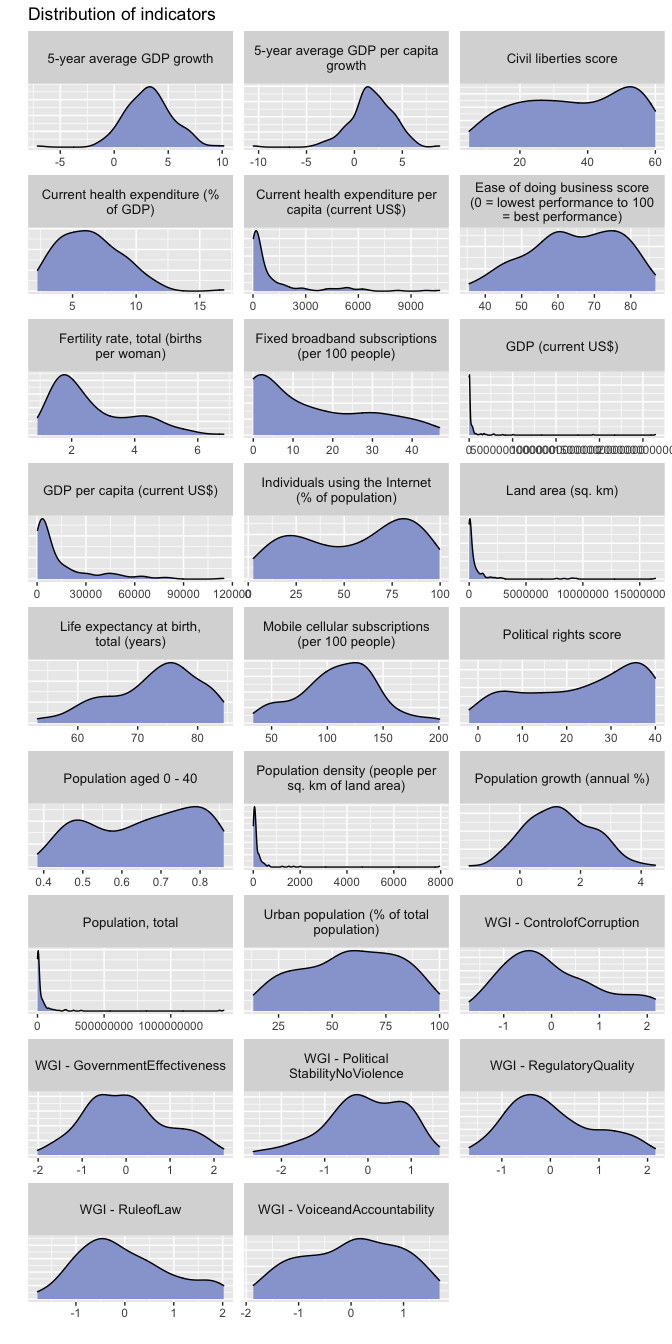
Principal component analysis
Many of the variables in our data vary together (covary), and the variation in one variable is likely to be duplicated in another. Principal component analysis (PCA) is a way of identifying the ways in which numeric predictors covary. The outcome of PCA is a smaller set of predictors than our original data that retain most of the variability of the full set of data. These predictors are called principal components, and are composites of the original predictors multiplied by a set of weights.
Tidymodels provides a simple API for running principal component analysis. We first load the package, and then specify a recipe for our model. In our recipe, we set the role of our categories, such as the country code, name and region as ids, so these are set aside from the modelling.
We also log transform some of our most skewed variables, and then normalise all our predictors. Normalisation converts each variable to a common scale of units, where the means are 0 and the standard deviations are 1. These two steps are required so that highly skewed variables (such as population) or those with very large numbers (such as GDP) don’t solely determine the outcome of the model. Log transforming reduces the range of the variables and normalising ensures all variables are expressed on the same scale of units.
We also set a threshold in our call to step_pca(). This ensures that
when we extract the PCA-transformed values, we’ll only retain those
components which cumulatively explain 80% of the variation in the data.
library(tidymodels)

development_recipe <- recipe(~ ., data = development_indicators) %>%
  update_role(country_code, country_name, region, sub_region, new_role = 'id') %>%
  step_log(`GDP (current US$)`,
           `Land area (sq. km)`,
           `Population, total`,
           `Population density (people per sq. km of land area)`, base = 2) %>%
  step_normalize(all_predictors()) %>%
  step_pca(all_predictors(), threshold = 0.8)

development_prep <- prep(development_recipe)

development_prep
## Data Recipe
##
## Inputs:
##
## role #variables
## id 4
## predictor 26
##
## Training data contained 170 data points and no missing data.
##
## Operations:
##
## Log transformation on GDP (current US$), Land area (sq. km), ... [trained]
## Centering and scaling for Current health expenditure (% of GDP), ... [trained]
## PCA extraction with Current health expenditure (% of GDP), ... [trained]The table below shows the proportion of variance explained by the returned principal components. Our original dataset consisted of 26 predictors, but the PCA has been able to reduce the number of predictors to just five components and still retain slightly more than 80% of the variance in the original data.
summary(development_prep$steps[[3]]$res) ## Importance of components:
## PC1 PC2 PC3 PC4 PC5 PC6 PC7 PC8 PC9 PC10 PC11 PC12 PC13
## Standard deviation 3.5859 1.7892 1.49817 1.33984 1.18539 1.04611 0.8471 0.74432 0.68828 0.59445 0.51567 0.48925 0.43806
## Proportion of Variance 0.4946 0.1231 0.08633 0.06905 0.05404 0.04209 0.0276 0.02131 0.01822 0.01359 0.01023 0.00921 0.00738
## Cumulative Proportion 0.4946 0.6177 0.70403 0.77307 0.82712 0.86921 0.8968 0.91811 0.93633 0.94992 0.96015 0.96936 0.97674
## PC14 PC15 PC16 PC17 PC18 PC19 PC20 PC21 PC22 PC23 PC24 PC25 PC26
## Standard deviation 0.38440 0.29469 0.28885 0.26168 0.22914 0.20653 0.18740 0.17107 0.16626 0.11676 0.11060 0.0721 0.004898
## Proportion of Variance 0.00568 0.00334 0.00321 0.00263 0.00202 0.00164 0.00135 0.00113 0.00106 0.00052 0.00047 0.0002 0.000000
## Cumulative Proportion 0.98242 0.98576 0.98897 0.99160 0.99362 0.99526 0.99662 0.99774 0.99880 0.99933 0.99980 1.0000 1.000000Let’s have a look at the most important variables to the top five principal components. The graph below shows which of the original variables contribute the most to the overall component scores.
tidyied_pca <- tidy(development_prep, 3)

tidyied_pca <- tidyied_pca %>%
  inner_join(indicators, by = c("terms" = "indicator_name"))

library(tidytext)

tidyied_pca %>%
  filter(str_extract(component, "(\\d)+") %>% as.numeric() <= 5) %>%
  group_by(component) %>%
  top_n(n = 8, wt = abs(value)) %>%
  mutate(component = fct_inorder(component)) %>%
  ungroup() %>%
  mutate(terms = reorder_within(terms, abs(value), component)) %>%
  ggplot(aes(abs(value), terms)) +
  geom_col(aes(fill = indicator_category)) +
  geom_vline(xintercept = 0) +
  scale_y_reordered() +
  guides(fill = guide_legend(title = "Category")) +
  theme(axis.text = element_text(size = 9), legend.position = 'top') +
  facet_wrap(~component, ncol = 2, scales = 'free') +
  labs(x = "", y = "")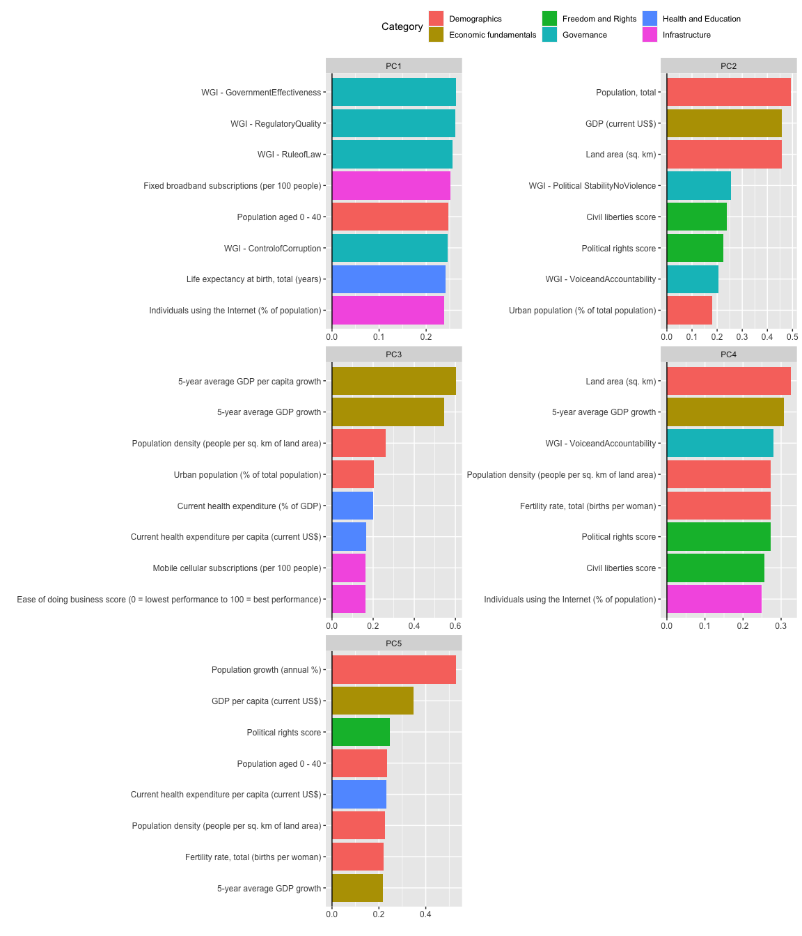
We can see that governance indicators feature prominently in the first principal component, as well as infrastructure variables related to Internet connectivity. The number of people under the age of 40 also contributes heavily to this component. Given that PC1 explains almost half the variation in our data, these are some of the most important indicators to explaining variation between countries.
The second principal component contains several variables related to absolute size or ‘bigness’, such as a country’s population, economic output and land area. We also see in this component the civil liberties and political rights scores of countries, which also explain much of the variation in the data.
We can also visualise the variation along the first two principal
components together. Using the bake() function from tidymodels, we can
return the development data transformed into the principal component
space.
The scatter plot shows the projection of each country into the first two principal components. We can see many European nations to the left hand side of the chart, these are countries which are likely to score well in the governance indicators, life expectancy, and Internet usage. The right hand side features many African nations, who will perform less well on these indicators.
As PC2 heavily relates to size, we can see towards the top of the visualisation many small nations (such as Grenada, Tonga and Kiribati) and large ones at the other end of the y axis (such as China, Russia and Brazil).
development_bake <- bake(development_prep, new_data = NULL)

development_bake %>%
  ggplot(aes(PC1, PC2)) +
  geom_point(aes(color = region)) +
  geom_text(aes(label = country_name), check_overlap = TRUE)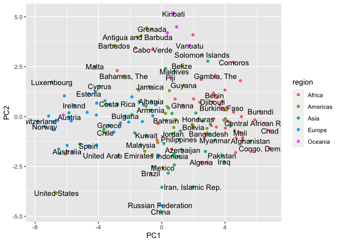
Clustering the principal component scores using k-means
We’ll now cluster the countries in the principal component space using k-means clustering. k-means is a simple yet very popular clustering technique that divides the data into k clusters by minimising the sum of the squared distances of each record to its assigned cluster.
We’ll run the k-means algorithm with several different values supplied to our k parameter.
set.seed(2021)

development_k-means <- development_bake %>%
  select(where(is.numeric))

kclusts <-
  tibble(k = 1:9) %>%
  mutate(
    kclust = map(k, ~k-means(development_k-means, .x)),
    glanced = map(kclust, glance),
    tidyied = map(kclust, tidy),
    augmented = map(kclust, augment, development_k-means)
  )

kclusts
    ## # A tibble: 9 x 5
    ##       k kclust   glanced          tidyied          augmented
    ##   <int> <list>   <list>           <list>           <list>
    ## 1     1 <k-means> <tibble [1 × 4]> <tibble [1 × 8]> <tibble [170 × 6]>
    ## 2     2 <k-means> <tibble [1 × 4]> <tibble [2 × 8]> <tibble [170 × 6]>
    ## 3     3 <k-means> <tibble [1 × 4]> <tibble [3 × 8]> <tibble [170 × 6]>
    ## 4     4 <k-means> <tibble [1 × 4]> <tibble [4 × 8]> <tibble [170 × 6]>
    ## 5     5 <k-means> <tibble [1 × 4]> <tibble [5 × 8]> <tibble [170 × 6]>
    ## 6     6 <k-means> <tibble [1 × 4]> <tibble [6 × 8]> <tibble [170 × 6]>
    ## 7     7 <k-means> <tibble [1 × 4]> <tibble [7 × 8]> <tibble [170 × 6]>
    ## 8     8 <k-means> <tibble [1 × 4]> <tibble [8 × 8]> <tibble [170 × 6]>
    ## 9     9 <k-means> <tibble [1 × 4]> <tibble [9 × 8]> <tibble [170 × 6]>
Identifying the ideal number of clusters in our data is quite hard. We see the drop in ‘withiness’ reduces after three clusters, but three clusters is likely too small to be much use in our case. We will, therefore, opt for four clusters.
clusterings <- kclusts %>%
  unnest(cols = c(glanced))

clusterings %>%
  ggplot(aes(k, tot.withinss)) +
  geom_line() +
  geom_point()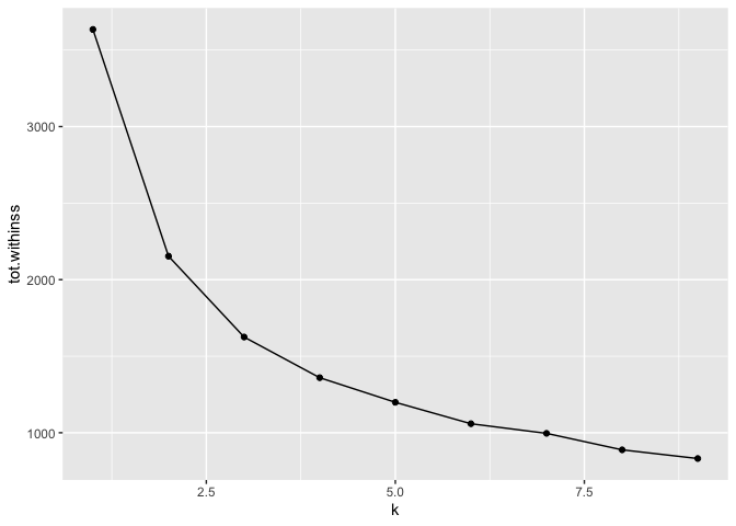
centres <- kclusts %>%
  filter(k == 4) %>%
  unnest(tidyied)
assignments <- kclusts %>%
filter(k == 4) %>%
unnest(cols = c(augmented)) %>%
pull(.cluster)
development_bake$cluster <- assignmentsLet’s now project these clusters back into our principal component scatter plot. We can see how the clustering algorithm has split these countries based on their position in the component space.
development_bake %>%
  ggplot(aes(PC1, PC2, color = cluster)) +
  geom_point() +
  geom_text(aes(label = country_name), color ='black', check_overlap = TRUE) +
  geom_rug()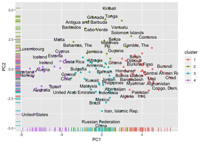
Finally, we’ll develop some terminology around each cluster to aid interpretation and project them onto a map.
development_bake <- development_bake %>%
  mutate(cluster_label = case_when(cluster == 1 ~ "Poor, but young",
                                   cluster == 2 ~ "Small, (mostly) free and developing",
                                   cluster == 3 ~ "(mostly) big and developing",
                                   cluster == 4 ~ "Rich, well governed and free"))

development_indicators <- development_indicators %>%
  inner_join(development_bake %>% select(country_code, cluster_label), by = c("country_code"))

library(rnaturalearth)
library(rnaturalearthdata)
library(sf)

world <- ne_countries(scale = "small", returnclass = "sf") %>%
  filter(geounit != 'Antarctica')

world_with_clusters <- world %>%
  select("country_code" = gu_a3, admin) %>%
  left_join(development_indicators)

world_with_clusters %>%
  ggplot() +
  geom_sf(aes(fill = factor(cluster_label)))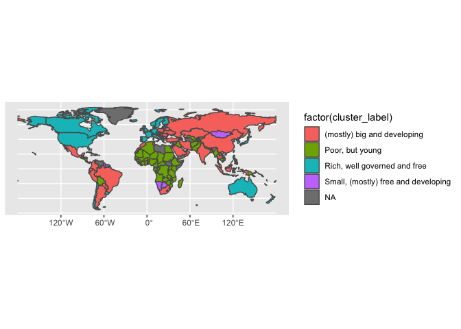
Footnotes
-
This analysis was inspired by the greatly superior work of Amelia Wattenberger and her excellent post on What Makes a Country Good ↩